LINQ Connect
Project Overview
The Product
LINQ Connect is your all-in-one platform for paying school fees, checking district menus, browsing the school store, reviewing forms, and managing meal balances.The Problem
Users find the current product's user experience challenging and are looking for a simpler, more user-friendly solution.The Goal
Re-designing the app will allow users to:
· Checking their district menus easier
· Simplify meal balance management
· Update their autopay and payment reminders
· Easily update profile informationMy Role
UX DesignerMy Responsibilities
· Analyze survey data
· Create an insight reviewing key issues found in LINQ Connect based on our survey data
· Discussions with stakeholders to see other pain points
· Mocked up revisions for key issues
· Get stakeholders buy in
· Eventually test mocks with users to get feedback
Understanding the User
LINQ Connect Temperature Check Pendo Results
Purpose: How are districts and families feeling about LINQ Connect following back-to-school season?
Date Surveyed: 9/6/23 - 9/14/23
This feedback was gathered from families from within LINQ Connect, both on the web and mobile. District feedback was collected from within LINQ District Nutrition, targeting users that configure LINQ Connect.
FULL INSIGHT HERE
Starting the Design
Home Page
Based on our Pendo temperature check, users identified a major concern: it took too many clicks to reach the school lunch menu. In the original design, there was no straightforward way to access it, requiring a total of 5 clicks. After the redesign, we introduced a dashboard widget for easy access to the school lunch menu. Now, users can quickly view lunch and breakfast options for the current and next day, with the added convenience of filtering by districts.

FULL DASHBOARD REDESIGN HERE
Settings / Autopay
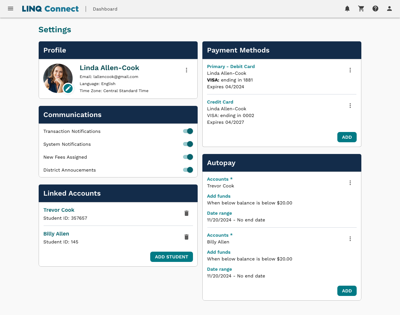
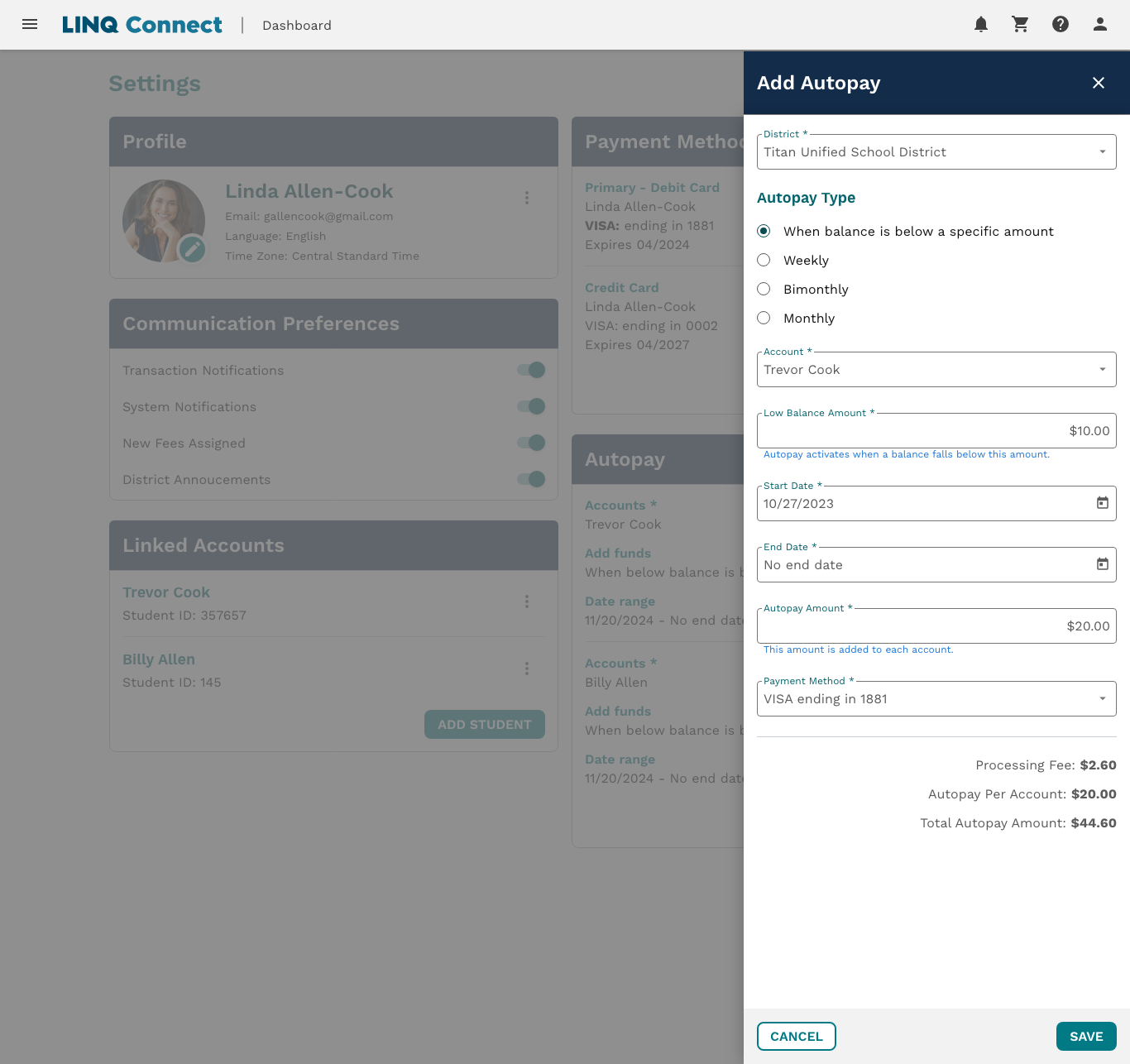
Following our Pendo temperature check, users expressed confusion about using autopay and setting it up. Although initially located in the "Meal Account" module, we've decided to relocate it to the settings for better clarity. This decision led to a revamp of the settings page to enhance the overall user experience.
Here is the redesign for the settings page

Here is the redesign for the autopay

FULL SETTINGS / AUTOPAY REDESIGN HERE
Transaction History
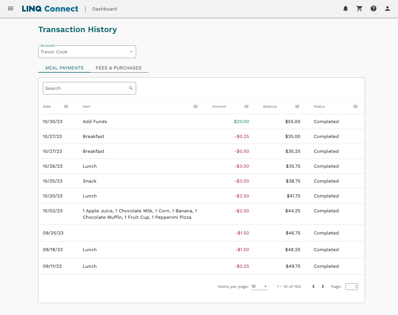
After checking user feedback with Pendo, we found users had trouble viewing purchased items due to a narrow column, a lack of transaction amounts, and frustration with insufficient history details. In the redesign, our goal was to enable users to view by account, meal payments, and fees & purchases for clearer understanding. To enhance clarity, we included the amount of the meal payment and the updated balance for better insight.
Here is the redesign for the settings page

FULL TRANSACTION HISTORY REDESIGN
Next Steps
We're currently in the process of implementing these changes and are actively identifying users in Pendo for testing. The plan is to roll out these updates behind a feature flag, allowing specific users who are willing to help us test the improvements to provide their thoughts and feedback on what is needed. Once we receive feedback, I'll revisit my designs and come up with new ideas based on what users are telling us.
Takeaways / What I’ve learned
Users prefer a simple interface, and the previous design appeared too complicated. They want something easy to understand, and the previous design lacked intuitiveness.
